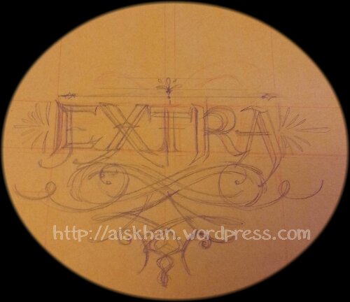
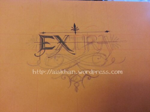
Original sketch.
I always end up with lots of loose pages in my sketchbooks, since I pull out pages, trace patterns, etc, so I’ve taken to adding a manila folder glued to the back cover to hold them. I looked at it and thought, “Damn, that’s one boring envelope..” so I started doodling on it.
Up Close with my dead pigment liner.
So, in my opinion, my main art weaknesses are perspective, architecture, buildings, landscapes, and text. My calligraphy could use some practice as well, despite what you may think there are a lot of flaws with these, particularly pertaining to decorative flourishes.
Despite those troubles, I think it’s fairly decent for a plain old envelope text design. It’s not perfectly symmetrical like I wanted, but I’ve only figured that out by using Illustrator. Seeing as I have little desire to bust out the digital software lately, I think this was pretty good at a first attempt (in 5+ years) at doing it by hand.
Also, both my remaining pigment liners died while filling in the X, so there won’t be any improvement on this until I can afford some new ones. Yes, I have Speedball India Ink, and fountain style nibs, but I hate using them on certain types of paper due to their bleeding behaviour, so I will stick to pigment liners for now.
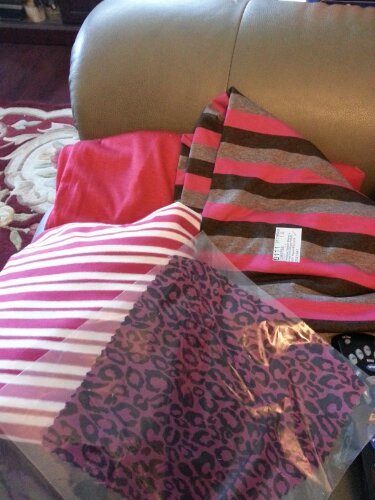
Suprise! You get a photo of some jersey fabrics, I bought recently.


